|
|
|||
|
|
|||
 Designing Apple Help Designing Apple Help
by Kevin Knabe from Interface Design & Document Design, The online help system included with Mac OS 8.5 is the product of a decade of research and development at Apple into how users can work most effectively with online help. At first the team focused on developing a help system optimally designed for answering procedural ("How do I…?") questions. Later they would broaden the scope of the help to better support goal formation and error recovery. They would also switch from a proprietary help technology to HTML to assure wider adoption by application developers. The new approach was strongly influenced by the principles of minimalist documentation, along with an ongoing process of itterative design and usability testing. This article summarizes the design efforts and presents a general set of guidelines for help writers and designers.
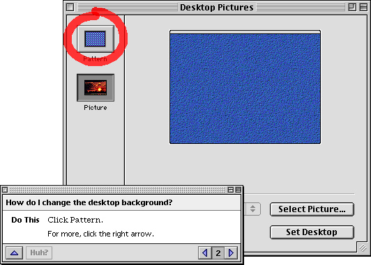
Early research Online help for the Mac OS began to take shape in 1988 when Apple's Human Interface Group reviewed the available literature on help, evaluated existing help systems, and conducted videotaped observations of user behavior. In several studies, users were observed thinking aloud while doing tasks in application programs. The team found that users tended to represent problems in the form of questions, and that questions fell into five general categories: • goal-oriented questions ("What can I do with this?") • descriptive questions ("What is this?") • procedural questions ("How do I do this?") • interpretive questions ("Why did that happen?") • navigational questions ("Where am I?") Additionally they found that most questions were either descriptive ("What is...?") or procedural ("How do I...?). Based on these findings, the designers proposed a system for asking and answering questions. A user would begin by choosing a question type, such as "What is…?" or "How do I…?" from the Help menu. Though this menu design was never fully implemented, two of the menu items eventually became part of the system. "What is…?" help took the form of Balloon Help, which was released with Mac OS 7.0. "How do I…?" help took the form of Apple Guide. The design of Apple Guide User testing of the Macintosh Electronic Reference - a HyperCard-based online reference for the Mac OS - illuminated many of the problems with traditional forms of online documentation. When users accessed help, they switched out of the context for doing a task. In order to follow the steps in the help, users had to repeatedly switch windows or else read and remember the entire sequence of steps. Users often skipped steps, performed steps incorrectly, or failed to branch appropriately on conditional instructions. [1] Apple Guide was designed to address the problem of layer switching. When users access help in Apple Guide, they stay in the active application. Instructions are presented in small system windows that float on top of everything else on the screen so that help is never covered. The instruction panels present one step at a time, so that instructions are small and unlikely to cover the functional interface. The user pages from one step to the next. The help is able to skip steps that the user has already completed and present remediation when the user gets off track. Another common problem with traditional online help is that users are confused by pictures of interface elements. They often click the pictures, mistaking them for functional interface elements. Rather than showing illustrations of objects on screen, Apple Guide points out the actual object by drawing a bright red circle (known as a coachmark) around the object, as in the figure below.
Figure 1: An Apple Guide panel along with a coachmark circling a button
Usability testing and market research Product teams conducted usability tests of help content as it was developed. Typically these tests would involve recruiting six to eight participants and having them think aloud while performing tasks with developmental software. Participants were encouraged to use the online help whenever they encountered a task that was unfamiliar. Usability testing helped identify a variety of problems. These included problems with the grouping of tasks in the table of contents, inadequate search keywords, problems with the naming of individual tasks, use of unfamiliar vocabulary, and the use of panels that were too big. Generally instructional designers were able to address these problems in rewrites. Market research indicated fairly low levels of usage and satisfaction. In focus groups, users complained that Apple Guide presented information too slowly and in inadequate depth. Although Apple Guide has been optimally designed to "spoon feed" the correct instructions to users, many users - particularly experienced users - didn’t want to be spoon fed. They wanted a more in-depth body of content that supported faster information access.
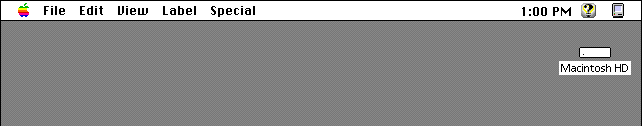
The experience of designing and testing Apple Guide helped inform the design of the next generation of help. In designing help for Mac OS 8.5, the designers sought to preserve the strengths of the existing system while addressing the known problems. Design Goal 1 The help menu introduced in Mac OS 7.0 appeared as a small question mark icon at the right of the menu bar. This design was chosen to assure that there would always be space available for the menu, even in applications with complex menus in space-intensive languages such as German.
Figure 2: Location of the Help menu in Mac OS 7.0
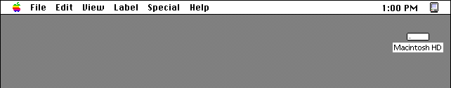
In Mac OS 8.0, an obvious solution was implemented; the menu was moved to the left and labeled "Help." Placing the menu on the path of exploratory learning has led to a noticeable increase in the discoverability and usage of help.
Figure 3: Location of the Help menu in Mac OS 8.0
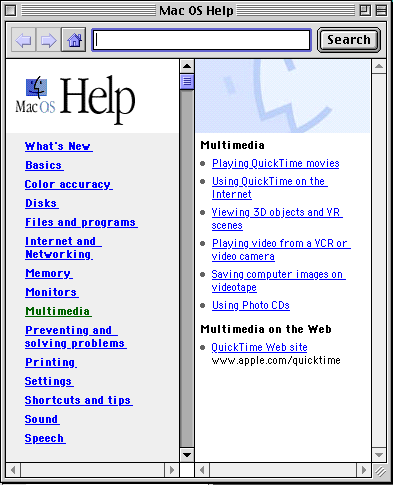
Apple Guide was not widely adopted by Macintosh application developers, partly because of the difficulty in scripting Apple Guide databases in the absence of a dedicated authoring tool. Also, many developers didn’t want to develop altogether separate versions of help for the Macintosh and Windows versions of their applications. It had become clear that HTML was the standard for authoring online information. It had become equally clear that the help for Mac OS should be HTML based. This would allow authors to use any of the available HTML authoring tools. It would also allow relatively easy porting of help content between the Mac OS and Windows. Design Goal 3 In Mac OS 8.5, all help for the Mac OS - procedural and non-procedural, local and Web-based - is available through a central point of access. All of the help is accessed through an application called Help Viewer, which pulls together a variety of help technologies. The Help Viewer lets users display and browse content written in HTML, perform full-text searches of HTML content on the hard disk, launch Apple Guide sequences for step-by-step guidance through complex procedures, open a Web browser to a specific URL, or run scripts to automate tasks.
Figure 4: The table of content for Mac OS 8.5 Help, displayed in the Help Viewer
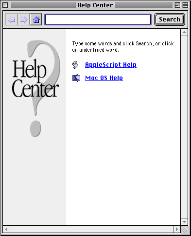
Figure 5: The Help Center
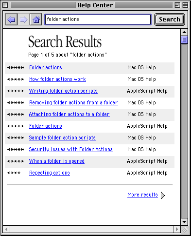
Figure 6: The results of a search
In phone surveys, a segment of users requested more comprehensive technical information. A great deal of this information had already been developed and was already available on Apple’s Web site. For instance, the Tech Info Library contained over ten thousand articles written by Apple’s Customer Support Division. It was therefore possible to vastly increase the volume of content in the help system by simply linking to existing content on the Web. (Notice in Figure 4 that one of the links is to the QuickTime Web Site.)
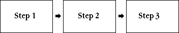
In writing Apple Guide sequences or other forms of step-by-step procedures, writers tended to approach a task as merely a series of actions, as illustrated below.
Figure 7: A linear task model
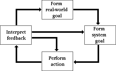
Figure 8: A broader, more itterative task model
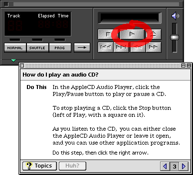
Design Goal 6 Although writers were encouraged to take broad view of tasks, they were also encouraged to write about only those aspects of the task that users were unlikely to figure out through exploratory learning. [3] In usability testing of Apple Guide content, writers saw that some tasks could always be done without help. Figure 9 shows one such example. AppleCD Audio Player, an application for playing audio CDs on a Macintosh, includes help for playing a CD. In five rounds of testing with over forty participants, no one was unable to do this task without help. In other words, no one ever needed the instruction shown in the figure below.
Figure 9: Example of an unnecessary instruction
Figure 10: Example of a minimalist approach
Notice also in Figure 10 that a button is provided for automatically opening AppleCD Audio Player. These "do it for me" buttons are used throughout the help, usually to open the window or dialog box that must be used to perform a task. The use of automation is limited to tasks that are scriptable within an application, and which do not require user input. When part of a task is automated, users tend to complete the task more quickly and with fewer errors. Although this approach goes against the conventional pedagogical wisdom, we have found that many users are willing to sacrifice learning in the interest of fast and successful task completion. We have also found that users can learn from an automated approach to a task; user test participants who rely on automation to complete a task at the beginning of a session often can complete identical or similar tasks without help at the end of the session.
The new approach led to remarkably high rates of task completion in usability studies. In one study, users completed tasks successfully in 21 of the 23 cases in which they used help (that is, after exploratory learning had failed). The core elements of the system - troubleshooting-focused writing, task automation, and the use of step-by-step guidance when appropriate - appear to support users well "when all else fails." Apple plans to do continued research into how well the new help system is accepted by developers and users in the field.
The information in this paper was gathered primarily from Apple internal technical reports. The author would like to acknowledge the people who contributed to those reports: Kate Gomoll, Tom Gomoll, Rachel Haas, Jeffrey Herman, Jeremy Hewes, Glenn Katz, Kristy Knabe, Gordon Meyer, Anne Nicol, Jim Palmer, Abigail Sellen, Mike Thompson, John Trumble, and Irene Wong.
|
|
|
|
|